Why bother?
When it comes to statistics, scientists need to define their terms very accurately. There are two terms that we see again and again in reports and studies. Those words are average and risk. Just being able to understand what mathematicians mean when they refer to these two terms, will give you a far better chance of making sensible decisions about your own well-being as well as making day to day assessments about everything from the results of political opinion polls to deciding whether or not to have a flutter on the Grand National.
The concept of average and level of risk are inextricably linked in the way we compute the results of clinical trials and population studies relating to longevity. Misunderstand one, and you are likely to misunderstand the other. Understand both, and you are far less likely to be taken in by scare stories and science-babble.
This is part one of the series Understanding Scientific Papers. Part two is entitled, A Short Guide to Evidence
Average
The word average is a term that emanates from medieval maritime insurance, and was used to define the amount of cargo damaged by ageing in the hold. It seems to have become synonymous very early on with the concept of normal. If an amount of grain was spoiled in transit, the shipper would wish to describe that quantity as no more of less than was normal, ie. average. Its statistical meaning, the arithmetic mean, only came into general use among scientists in the 18th century, when average was defined as the medium amount, the ruling quantity, rate or degree; the common run (1755). The term average then started to trickle back into general use, where in the 19th century, concepts such as normal or ordinary were used to describe an average and the phrase above average was coined (1867). [1] Today there are three terms we see regularly in scientific texts that describe the central result, or most common result. These terms are;
-
- Average
- Mean
- Median
Average and mean, describe pretty well the same thing. The median is something very different.
Look the following sequence;
1, 1, 1, 2, 2, 8, 9
The average of these figures is 3.43, derived by adding all the numbers up and dividing by the number of results. [(1+1+1+2+2+8+9)/7]
The median for this series is the value represented by the central result. There will be the same number of results above the median than below it.
M
1, 1, 1, 2, 2, 8, 9
The median of this sequence, the middle result, is 2.
If you were looking at a room full of children, you might conclude that most of them were babies and toddlers ie. with a median age of two years, but if you were sharing out portions of chocolate between seven children, they would probably insist that you’d want to try a give everyone an average of 3.42 pieces. But, sometimes the average, mean or median won’t do.
Percentiles
There are occasions where the average, in any guise, won’t do. If, for example you are looking at age in a population, you might not want to look at the average. Very old survivors, or a high rate of infant mortality might skew the results. You could look at the median lifespan in a group of people. But the result would only hold true for that specific cohort and could not be used to prove and wider truths.
We estimate an animal’s maximum lifespan by working out the average lifespan of the longest lived 10% in a given group – the 10th percentile. Using this metric, the average maximum lifespan for UK individuals is currently just shy of 100 years.
In this example, trying to calculate maximum lifespan by using the longest time any single person has ever lived, would be fraught with difficulty. And an average or median would be useless, the figure would in no way represent longevity. But by using percentiles we can use a much smaller sample to get a good idea of the situation. By taking the 10th percentile – the longest lived 10% – from a given group – we can make a good estimate of what longevity really means for that cohort. The analysis is often used for salaries, comparing the top earning 10, 20 or 25% with the lowest earners, without needing to take too much notice of outliers in either direction.
What is normal?
Until we understand the normal in any population group, we have no way to establishing whether any particular lifestyle choice or intervention will improve the situation. Any study also faces the challenge that it will be partial. It will only look at a group of people in one place at one time, however extensive that study might be.
Almost all the studies I quote in this website, use a set of statistical mechanisms that have been developed over the years, in order to test the ideas that researchers wish to scrutinise. In a randomised controlled trial, a clinical study looks at two sets of individuals, one that receives the treatment and one that does not. In some studies, the secondary (control) group receive a conventional treatment. It would be unethical to fail to treat sick people purely out of scientific interest. In this type of study, especially if the ample size is smaller, the two groups are matched as far as possible. In addition, they are entered into the treatment or control group randomly (and usually blindly) so that the statisticians only have to compare the treatment, rather than any confounding issues such as gender, age etc.
In epidemiological studies, we follow a large cohort, or we look backwards, seeing whether people who have followed one particular lifestyle choice, or medicine have fared better than a similar matched group who have chosen to follow a different prescription. This isn’t quite as pure as a randomised controlled clinical trial, but such studies have the advantage of taking place in the real world. They also often have thousands or millions of data points – and in statistics the number of people in a study adds to the likelihood that it will prove representative. A classic example of such studies were the smoking studies undertaken in the 60s that confirmed beyond reasonable doubt that smoking is harmful.
Risk
What we need to know is just how harmful certain behaviours are, or conversely, how beneficial new treatments might be. What we are talking about here is risk. Medical risk is defined in many different ways. It can relate to risk of death, risk of receiving a diagnosis or chances of survival. It’s expressed as a percentage or a number, for example;
50% of those diagnosed with cancer in the UK survive for more than ten years.
Getting sunburnt just once every 2 years can triple your risk of melanoma skin cancer. [2]
How risk is calculated?
When we calculate risk, we use a mathematical model to make sense of a whole series of disparate results. In order to do this, we need to know something about what we might expect to happen, what might be normal? Imagine measuring the height of 20 men at random. You might get a set of results that look something like the table here;

If we simply list each result, we don’t get much of an insight into what’s going on. We could plot those results on a graph, but still we would have little knowledge of whether these men were representative of the wider population. The raw data tells us little.
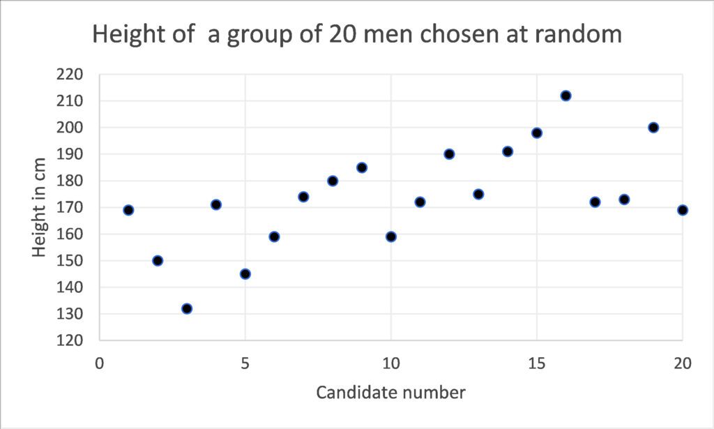
If we group these results, we can give ourselves more of an idea. Below, the diagram shows the same data, but in this case the men’s heights are grouped into cohorts. Immediately we can see that 171-190cm is the most common height and by looking at the curve that plots the same data we can see that the average height is somewhere around 170cm. The presence of a one very tall man in the group at number 16, who is 212cm tall, or 6 foot 11 inches, does not invalidate the rest of the data. Thus, this sort of analysis tells us a lot about the average, but not so much about the tallest or shortest person in the world. But, even with a small group of randomly selected people we can start to get a picture of how randomly something like adult height is distributed. We can see this very typical curve revealed to us, where most people have a height that is quite somewhere close to the average and as we go further from that average we find there are fewer and fewer people.
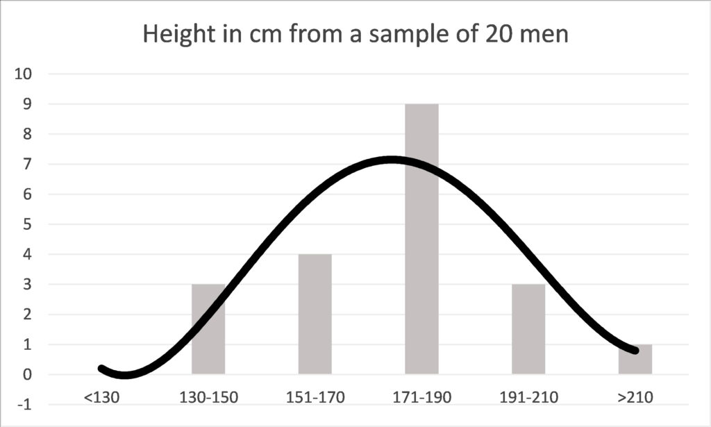
This curve, depicts a normal distribution and elucidates one of nature’s most interesting facets – a tendency to be average. The height of men, our weight, our metabolic rate, heart rate and how fast we can run will return such a curve in many groups of people. This gives us a baseline, about which we can study variations in different cohorts.
Some might be tempted to describe the average as normal. But this bell-curve tells a different story about what normal means. Every single one of the results relating to height are normal in the statistical sense, because they all contribute to the curve of normal distribution. If the above graph depicted running speed instead of height, then the man at number 16, would be the Olympic athlete. Exceptional, but still part of a normal distribution.
What is normal?
Once we have plotted a set of results, we can compare even a small number of data points by finding where the average and the normal distribution around the average might be. Because of this fundamental feature in nature, the spread of results is highly likely to form this very distinctive bell-curve. It comes from mathematical calculations, but it happens to look rather elegant too. The curve may have a very marked peak, or it might make a much flatter line. In reality that curve is rarely so perfect, it might be a bit skewed, or uneven. But as long as the bell-curve is approximately even, then all the statistical analysis that we make, and will be valid.

The bell-curve – Gaussian or normal distribution. Source: Wiki Commons. Author D Wells.
Carl Friedrich Gauss, invented the mathematics that describes the bell curve, transforming what on first analysis might seem to be random data, into elegant statistics. Since then, by using Gaussian mathematics, we have been able to show that these bell-curves apply to everything from the duration of human pregnancy, the amount of haemoglobin in 100 ml of blood, the number of rain drops falling in a storm to the life of automatic dishwashers.
But what is really magical about the bell-curve is that it can be used to make predictions. The mathematics can be used to tell us how far differences between different populations are a matter of sheer chance, or have important significance. If most of the results from our study lie within a certain distance from the average, we can tell that the spread is not simply a quirk of chance. We can predict, to a defined level of confidence, that if we were to re-run the experiment, we would get similar results.
The critical level of confidence that science likes to use is 95%. In the diagram above you can see that 95% of the results are likely to occur in the mid-grey zone, ie. they will lie a known distance from the average. If this distance is very wide, we cannot be so sure, but if the confidence interval is narrow, we can be surer of the accuracy of our predictions. We haven’t been required to test millions of people, a well conducted trial, using a thousand or so individuals, will give us a good clue to the wider implications. This is how opinion polls are structured. In the UK very accurate polls, covering a voting population of about 47 million people are calculated on the basis of a survey of a couple of thousand people who are selected to be representative of the entire population.
Causation and correlation
Even if we can get all the statistics to work, we are still not sure whether the effects are due to a specific cause or simply a correlation, a chance relationship between two factors. Further evidence must be sought to find the cause. That might be achieved using further statistical calculations. For example, one might want to mathematically discount other relationships. In medical analysis it is customary to examine other potential confounders such as age, gender, occupation and underlying disease might have influenced the results.
In addition, we would want to examine the medical mechanisms that might be causing the correlation. This is likely to be considered in the commentary of a statistical paper, but more than likely each idea will be ‘ticked-off’ by other complementary studies, that together form a body of evidence. It is rarely just one study that proves or disproves an original hypothesis. We take the evidence from many studies, carried out in different ways, in order to gain a good understanding of what is going on. In studies of COVID-19 variants, scientists make a laboratory analysis in a Petri dish first, to discover how dangerous the variant might be. By looking at the efficacy of existing vaccine antibodies on these novel variants, we can take a view as to how likely the vaccines will be to protect against new variants as they emerge. Other studies model the precise protein structure of each variant so that we can assess how similar or different they are and how potent they may or may not be. This gives us time to change the formulation if we see something concerning. Evidence from the vaccination programme will come in more slowly and hopefully confirm by sheer numbers that the new variants we have in the UK today are beaten by existing formulations.
Odds
When we know that we are dealing with normal distribution, all sorts of other mathematical analyses are open to us. One of the most powerful, is the estimation of the odds that something will happen. Odds help us predict the future.
Anyone who has had the odd flutter will know what the odds mean. The odds of a horse coming in might be ten to one. If it runs ten times, it would be predicted to win once. In science odds are just the same. They might be written 10:1, or they might be expressed as a percentage, in this case 10%. But just like tossing a coin, even though the odds between heads and tails are even (1:1), you might toss it ten times and never see heads turning up.
Ratios
Hazard ratios, relative risk and odds ratio, often shortened to HR, RR or OR can be found frequently in scientific papers. Hazard ratio relates to a moment in time and is often used to quantify levels of survival. Relative risk and odds ratio are used to quantify the chances of something that might happen over the course of time, by comparing different treatments or lifestyles, for example the risk of smoking leading to cancer, or of diets leading to weight-loss. So, any student of longevity needs to understand these terms, in order to make sensible health decisions.
Scientific studies tend to compare two or more interventions. For example, the odds of a certain diet leading to a 10% loss of weight might be 10:1 for all women over 40. The same study might also look at the odds that women who follow a different diet can lose the same amount of weight. Those odds might be different, let’s imagine they are 8:1. The odds ration simply divide one set of odds by the other, in order for us to decide which intervention is, on average, more effective. 10/8 = 1.25, so the odds ratio of the two diets would be written like this;
OR 1.25
It means that the second diet is 25% more likely to be successful than the first diet.
Put another way, if 160 women start two different diets on the same day, 80 using one diet and 80 trying the different diet, then 8 women would be successful on the first diet (10:1) and 10 women (10:1) on the second diet. So, the second diet is better? In general, yes, but that doesn’t mean that the diet is necessarily better for you. There might be differences between those who have busy lives and those who are more sedentary, those who can cook and those who prefer ready meals. Differences such as occupation, levels of activity or cooking skills are called confounding characteristics.
Any odds ratio (OR) above 1 represents a higher likelihood. Any ratio below 1 represents a lower likelihood. However, be careful to scrutinise the statistical accuracy of the result. In smaller populations different odds can occur simply by chance. Neither can the figures prove the cause of that difference, only that there is one.
Confidence Interval
Here is a typical result from a study that tracked overweight men to find out how many developed diabetes type 2;
Compared with the normal weight group, age-adjusted odds ratios for obese Renfrew/Paisley men was 7.26 (95% CI 5.26, 10.04), respectively. Further subdividing the normal, overweight and obese groups showed increasing odds ratios with increasing BMI, even at the higher normal level. Assuming a causal relation, around 60% of cases of diabetes could have been prevented if everyone had been of normal weight. [3]
The shocking figure is that men who were obese in this study were over 7 (7.24) times more likely to develop diabetes than men of normal weight. The Odds Ratio (OR) in this example was calculated by dividing the number of people who were obese and developed diabetes, with those of a normal weight, who developed the condition. The study also reports how accurate that figure is likely to be;
95% CI 5.26, 10.04
CI stands for confidence interval. In all studies statisticians can work out whether the results are a factor of chance, or whether we can be confident that the statistics are valid. This study reports the 95% confidence interval, and stems from the normal distribution curve we can see in the diagram above. In this case the results suggest that we can be 95% confident that the true result lies between 5.26 and 10.04. ie. that the chances of obese patients developing diabetes lie somewhere between those two figures. They are both worryingly high figures, so whether you are five times more likely or ten times more likely to develop the condition, it might certainly be wise to consider losing weight.
The 95% confidence interval provides a measure of accuracy, and a level of certainty. If the results had been less stark, say an odds ratio of 1.25 (as was discussed in the women’s diet example) we might not have been so alarmed. In particular if the 95% confidence interval had been say;
95% CI 0.75, 1.35
we could not have been sure that there is any correlation at all. That is because the 95% confidence interval straddles 1 – the neutral point. This is the topmost point on the bell curve, results above that line will show that a the second diet was the most effective, results below the line show that the first diet might be more effective. Even though the odds ratio gives a positive result the 95% confidence interval suggests that the result might only be a chance result. In that case we talk about a trend, but not a significant difference.
In the diabetes study you will see that the results report an age-adjusted odds ratio. We already know that age effects our susceptibility to metabolic diseases such as diabetes type 2. IN this study gae is definitely a confounding condition. If it so happened that all the sufferers were older, we could not provie the link with obesity. THus the odds ratio and confidence interval have been calculated to take account of age differences, giving us further confidence that it is the obesity that is the cause of the disease, and not simply ageing.
Adjusted Life Years (QALYs and DALYs)
Both the term QALY and DALY are used to equate the efficacy of a treatment or policy for older people. QALY looks at healthy years gained by an intervention or treatment, while DALY looks at healthy years lost, compared to average life expectancy. [4]
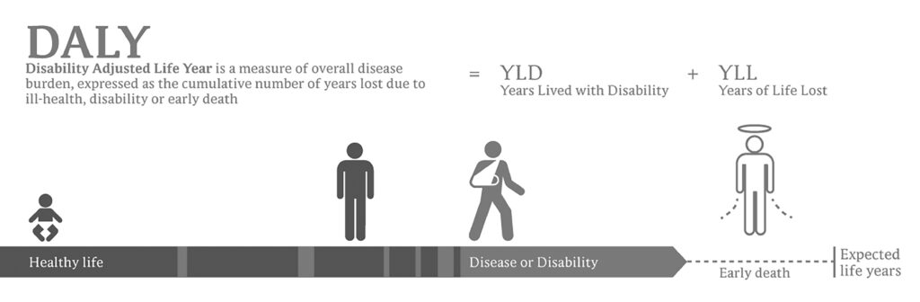
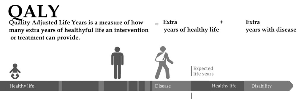
Thus, both the DALY and the QALY are measures of morbidity – the level or number of diseases or conditions in an individual – and mortality – when death occurs. These are important measures. We don’t want life at any price. The aim is to find ways of achieving and healthy and happy longevity, as free as possible from disability and disease.
[1] Shorter Oxford English Dictionary. Third Edition, Oxford, Clarendon Press 1975 [2] Quotations from Website https://www.cancerresearchuk.org/ retrieved January 2021 [3] Hart CL, et al. (2007) How many cases of Type 2 diabetes mellitus are due to being overweight in middle age? Evidence from the Midspan prospective cohort studies using mention of diabetes mellitus on hospital discharge or death records. Diabetes Medicine. 2007 Jan;24(1):73-80. doi: 10.1111/j.1464-5491.2007.02016.x. PMID: 17227327. [4] IMage DALY and QALY Credit: Wikipedia commons Planeman, modified by the author.A beta reader is a test reader of an unreleased work (similar to beta testing in software), who gives feedback to the author, from the perspective of an average reader. If you’d like to help me get this book as good as it can be, I’d love to hear from you. You’ve got plenty of time to make up your mind. The chapters will be ready from June onwards. I’m sorry there is no fee for this work, except a free copy of the finished book and an acknowledgement. This is not a commercial exercise. Say Tomato, the publisher of the book and of the website is run as a self-financed social enterprise. I shall be eternally grateful. Any profits from Glorious Summer will be directed into Say Tomato’s work for women over 40.
Contact me directly wendy@wendyshillam.co.uk if you are interested, giving a brief description of yourself and your reading experience. (It doesn’t matter if you haven’t done any beta reading before – avid readers make the best beta readers.) Thank you.


Wendy Shillam
Trained in environmental and bio-sciences, at Bristol Univeristy and University College London, Wendy Shillam is a registered clinical nutritionist, specialising in longevity. She is the founder of the social enterprise Say Tomato! that provides free and trusted weight loss advice for women over forty. This part of the blog is a precursor to publication of her book, Glorious Summer – the secrets of longevity. You can read about it here.